Portrait Project
|
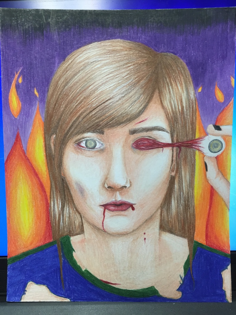
1) This drawing contains a lot of color contrast. There's very bright colors, with both highlights and shadows, that draws the viewer's attention in. The subject of the portrait, me, is apparently in some sort of hellish place. Instead of just doing zombie, I added vampire bites and several bruises and lacerations. The skin is still a beige color, showing that the subject is still technically 'alive', but all of these gruesome things are happening to the subject. I wanted it to be clear that it wasn't a typical zombie. It just had a really really bad life. I think the highlights in the hair turned out really well. Blending the prismacolors was hard, I'm not particularly proud of the shading on the nose, but the rest is decent. I think the blending on the face turned out really well.
2) The value in this drawing is extremely present. I barely left any white from the original paper on this piece, so it's completely colored in using the prismacolors. I think the most important aesthetic quality in my piece was really the eye getting pulled out. I worked really hard to make that look as real as possible. There's so many colors in it that all make sense together in the piece that it helps with any parts that may be unbalanced looking. The style of the piece is still very cartoon like, as all of my pieces tend to be, but the hellish theme of the piece fits really well with the cartoonish style of the image. Because this was my first time trying to do a full portrait with prismacolors, I tried really hard to focus on blending all of the colors together and laying down my whites, which I think really helped me in the long run. 3) I think the emotion that people feel when looking at this is mostly fear. When I showed my sister this she screamed and had to look away because of the eye getting pulled out of the skull. Other people have had similar reactions, saying that it's cringey and they can't look at it (for some reason I don't think it's that bad), but because the focal point of the piece was the eye getting pulled out, so a lot of time went into making that look as good as possible. |
Portrait Project: Pre-Final

|
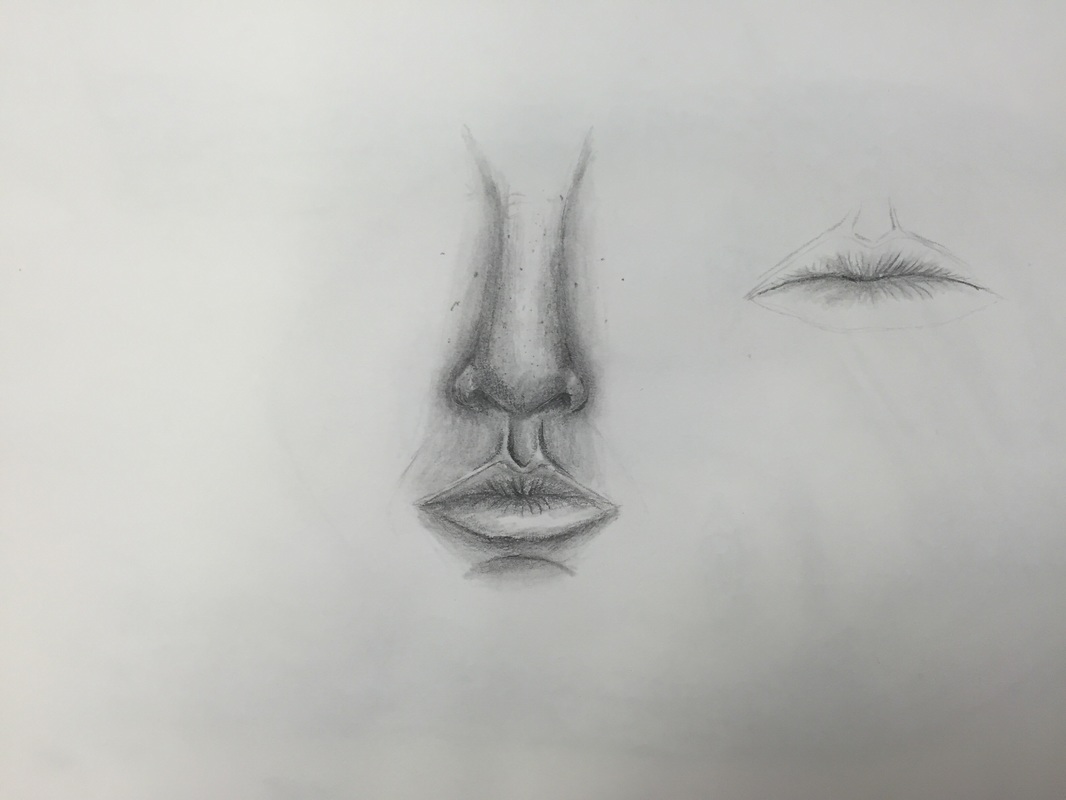
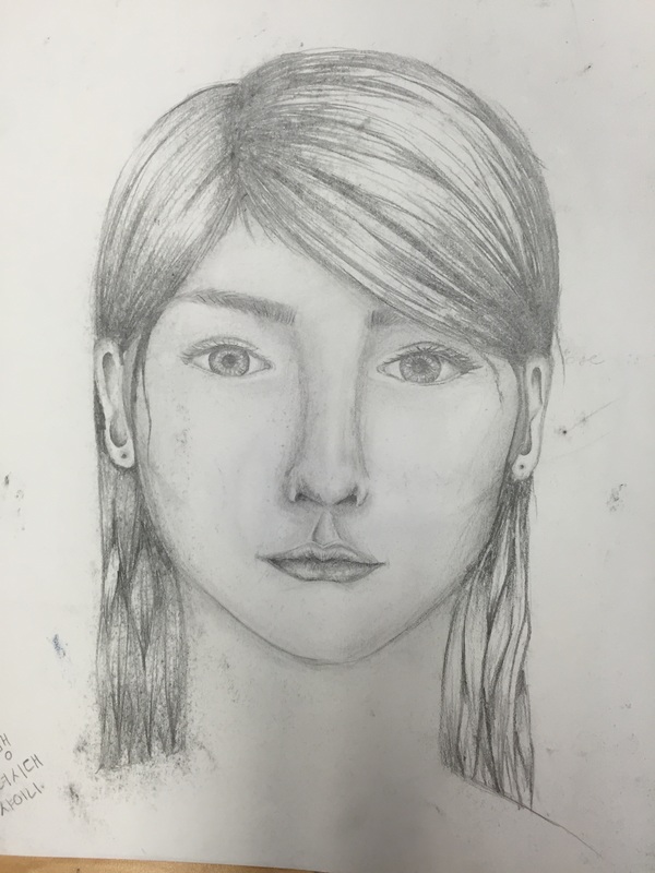
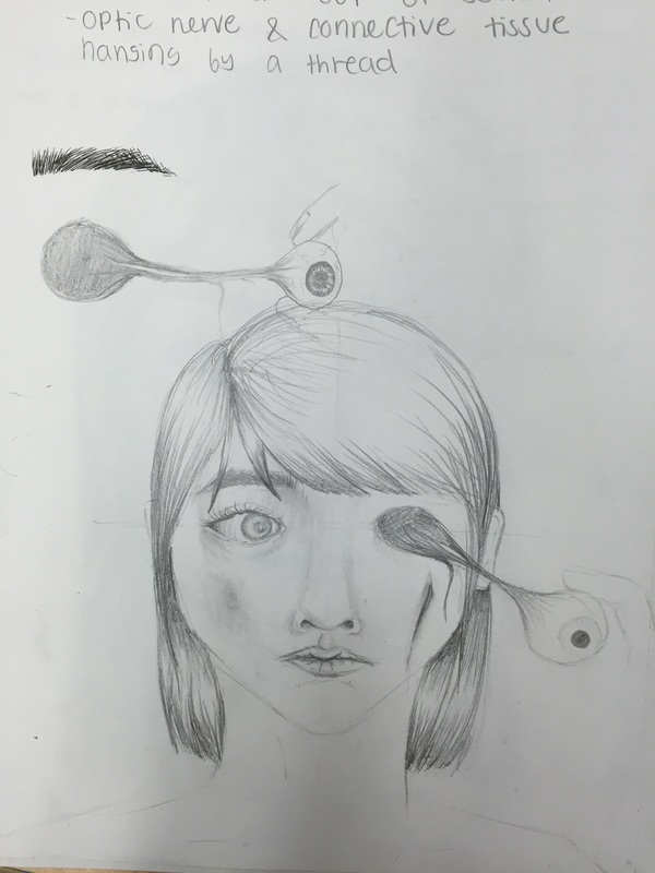
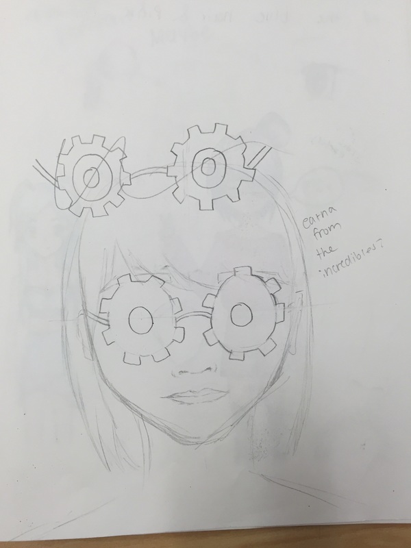
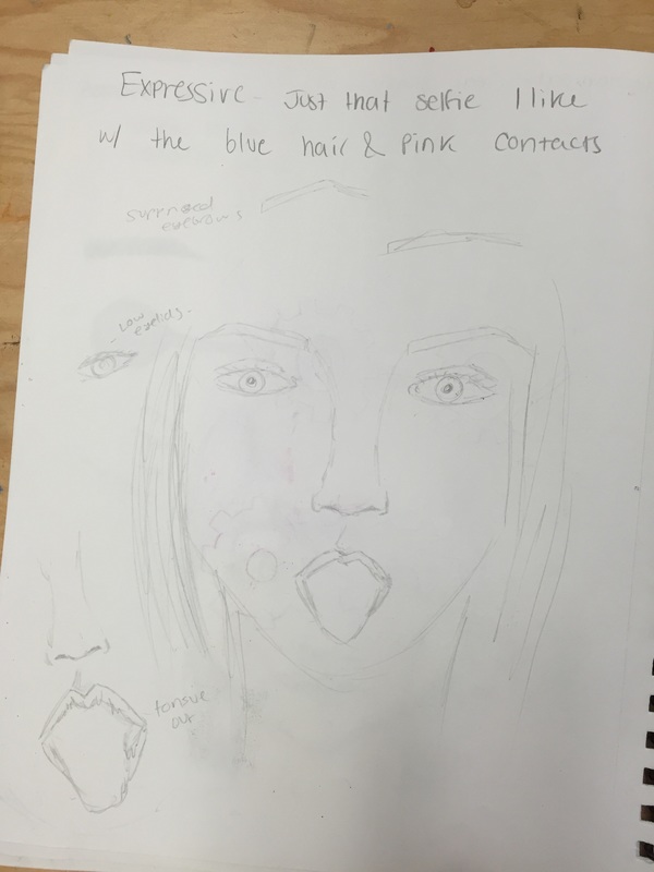
Before our final portrait we researched drawing body parts like eyes, nose, and lips- and then we were to recreate them. My proportions sketch I ended up turning into my initial sketch of myself, so I just added on top of it. We also had to come up with sketches for 3 portrait ideas- zombie, mechanical, or expressive. For my zombie portrait idea I wanted the focal point of the piece to be the eye coming out of the socket. The mechanical portrait would have been eyeglasses in the shape of gears, and my expressive would've just been a selfie I took that was cool. I knew I wasn't going to do my expressive one so that one was just a quick sketch. I spent more time on the zombie one, knowing that that one would be the one I do the final for.
|
Opacity Project- Prismacolor
|
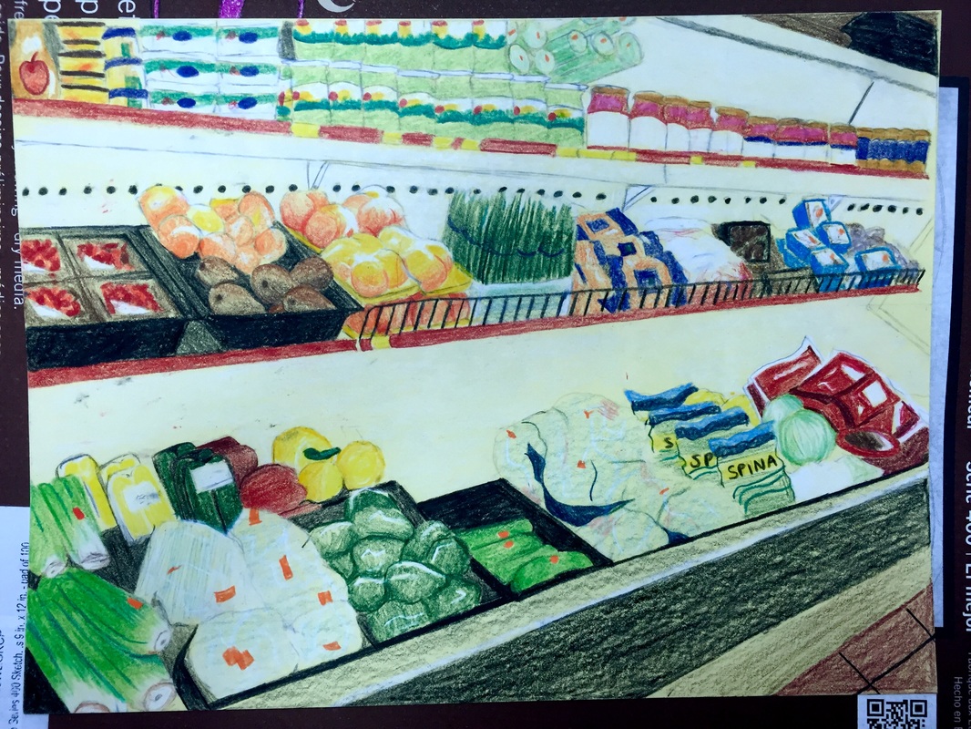
1) I think something I did really well with this project was actually the craftsmanship. This project was a lot to handle because there's so much going on in the image, there was a lot of opportunity to mess up here. I think given the circumstances, I was able to take a potentially messy piece and keep it in order.
2) My piece is placed in a really aesthetically pleasing position. By that I mean the perspective is all in order, so looking at it feels realistic and all the size of the products corresponds with the scene going farther into the distance. 3) Because I was working from a reference picture, I did my best to recreate those colors using the materials I had available. The use of multiple colors and color contrast really helped make the piece look interesting. 4) My color contrast is a huge focal point in this piece. A lot of different, brightly colored products together draws a viewer in, and the use of tons of different colors all together creates dimension and a feel of interest to the piece. 5) Because there are so many different objects in the image, things are bound to have different textures. For example, the smoothness of the celery stalks is different from the crackly bags the cabbage (next to the spinach bags). Highlights were hard for me to do, but the white gel pen that Mrs. Rossi gave me helped me create the highlights on the peaches and lots of other objects at the end of the project. 6) The background color I chose was a light, soft yellow. I went into this project knowing I wanted to do the product aisle in a grocery store, and I feel like the pale yellow gives off that feel of the ambient light in the stores. 7) When doing this project I had to remember that prismacolors are NOT pastels. You can add white on top of other colors using pastels to show highlights and they're not going to look too muddy. With prismacolors, you can't just put white on top of any color and expect it to be white. You have to first lay down the white, and it can be hard to get that technique right so that it accurately displays the highlights. 8) For me it was the highlights showing opacity. Those were really hard for me to display because I'm not entirely used to showing highlights on small objects that aren't anime characters (lol). Towards the end it helped to be able to use the gel pen, but if I were to go back and do it again, I think I would try to focus more on the highlights in the beginning rather than the construct of the piece. |
Progression Drawing
|
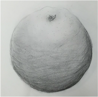
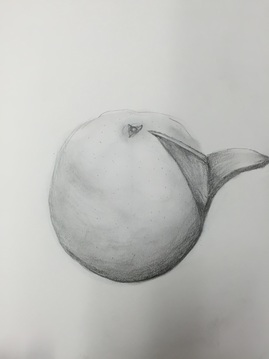
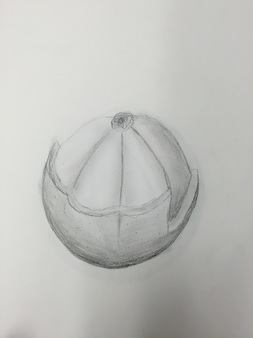
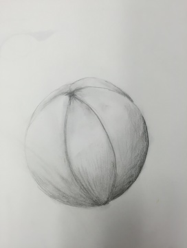
1) In this project, value was used to depict the differences in shading around the orange. Since oranges are spheres, value is really important to be able to show the shape of the fruit.
2) For some reason when creating this piece, I couldn't get the detail right, which was really upsetting because I was really excited about the idea. The whole thing looks pretty vague. I don't hate the first two parts of the progression project but the last two I was unhappy with. 3) I didn't use a wrapper, since I chose to do the fruit instead of the candy. 4) If the texture had been better, it would've been really important in showing which fruit it was. Since an orange is a pretty plain fruit, you'd have to have pretty good detail to let the viewer know that it was an orange, especially since the image is in graphite so color can't be determined. 5) I would spend more time on specific parts of the orange instead of focusing on the orange as a whole, I think the detail could've been better had I done that. I also wish the value could've been better, because I used graphite instead of charcoal the value was low. Lastly, I wish I had focused on the last two images more than I did. While the first two aren't perfect, they're definitely better than the last two. I think I got discouraged while creating the first two and then gave up towards the end. If I had spent more time on them I think it would've turned out better. Random note- one thing I really liked was the little circle thing at the top of the orange. It looked really similar to the actual one on the orange. At least there's one decent thing about this project. |
Contour Hands
|
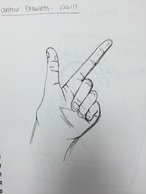
This drawing of a hand is from the beginning of the class when we were experimenting with contour drawing. I personally am not a fan of contour drawings, I don't like not being able to lift my hand off the paper and sketch, but this wasn't the worst thing I've ever done. The hand itself looks a little short, the palm doesn't look completely human but the fingers are okay! The nails are that short because my nails actually are that short :-)
|
Dum Dum Drawing
|
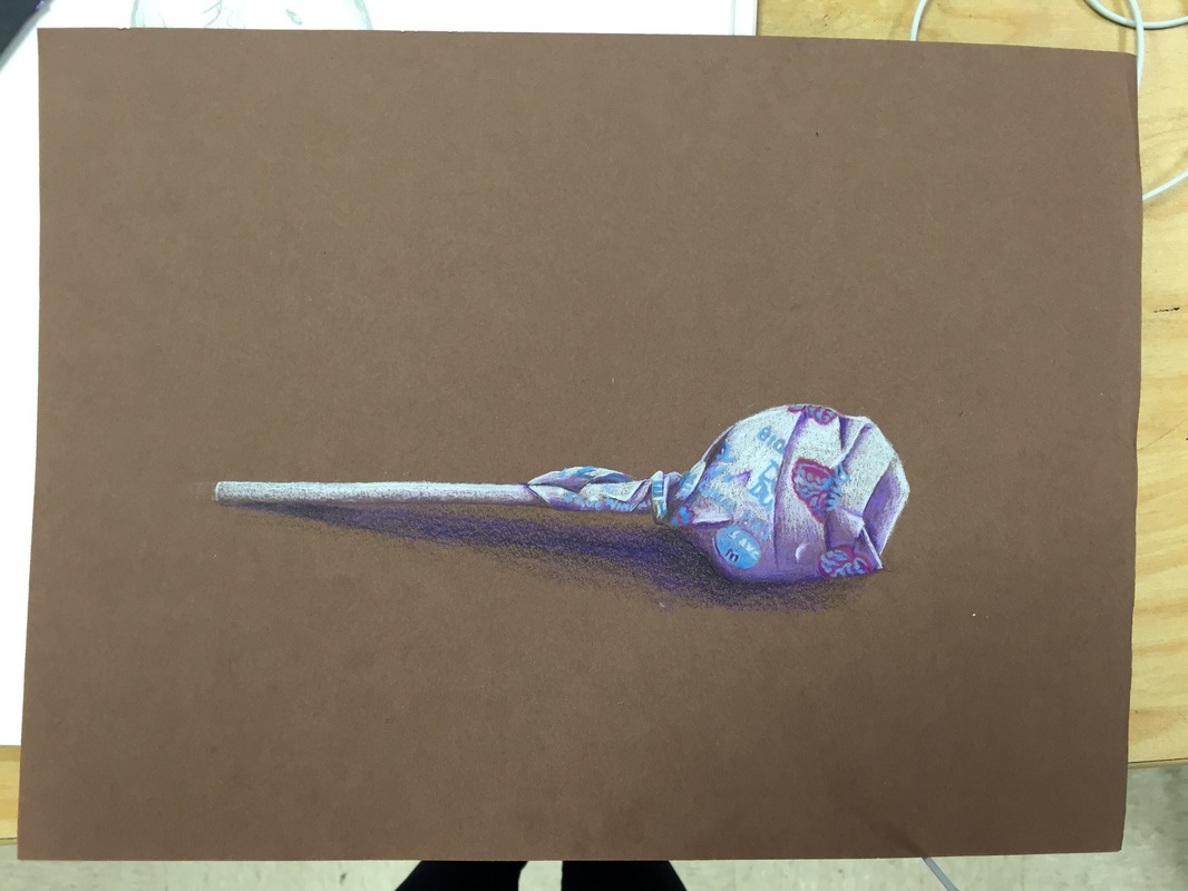
For this project we were told to draw a dum dum lollipop, but instead of using straight black for shadows she wanted us to use a different color to represent the shadow. Because my lollipop was blue and some pink, I thought purple would look really good with the other colors so I used a dark purple prismacolor for the dark shadows and a lavender purple for the lighter shadows.
I think this is one of my favorite pieces that I've done in this class. I think the value turned out super well, and it looks like a lollipop to me. Even the stick of the lollipop looks good, and I didn't think it would for some reason. I tried to use darker colors for the parts of the lollipop that got closer to you, and as it got farther away the colors got lighter. I think this helped me a lot in figuring out how to use prismacolors properly and how to draw shadows without using black. |
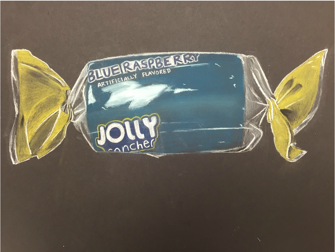
Chalk Pastels- Jolly Rancher
|
For this project we worked with chalk pastels or colored pencils. I chose to work with chalk pastel pencils. I prefer colored pencils normally but this time I chose the chalk pastels to step out of my comfort zone (I hate chalk pastels). I was really lucky because the colors came out almost EXACTLY the same colors as the actual jolly rancher. I think the logo looks pretty good, but the big highlight is something I can't get over. I hate it, it looks like a splotch of bluey/white in the middle of the candy.
The twisty parts of the wrapper are something I really enjoy, especially the one on the left. I think they turned out pretty realistic, and other than that one giant highlight, the others look good. Overall I think it's a pretty decent finished project and I think if I were to practice them and get better they'd actually end up looking really cool. |
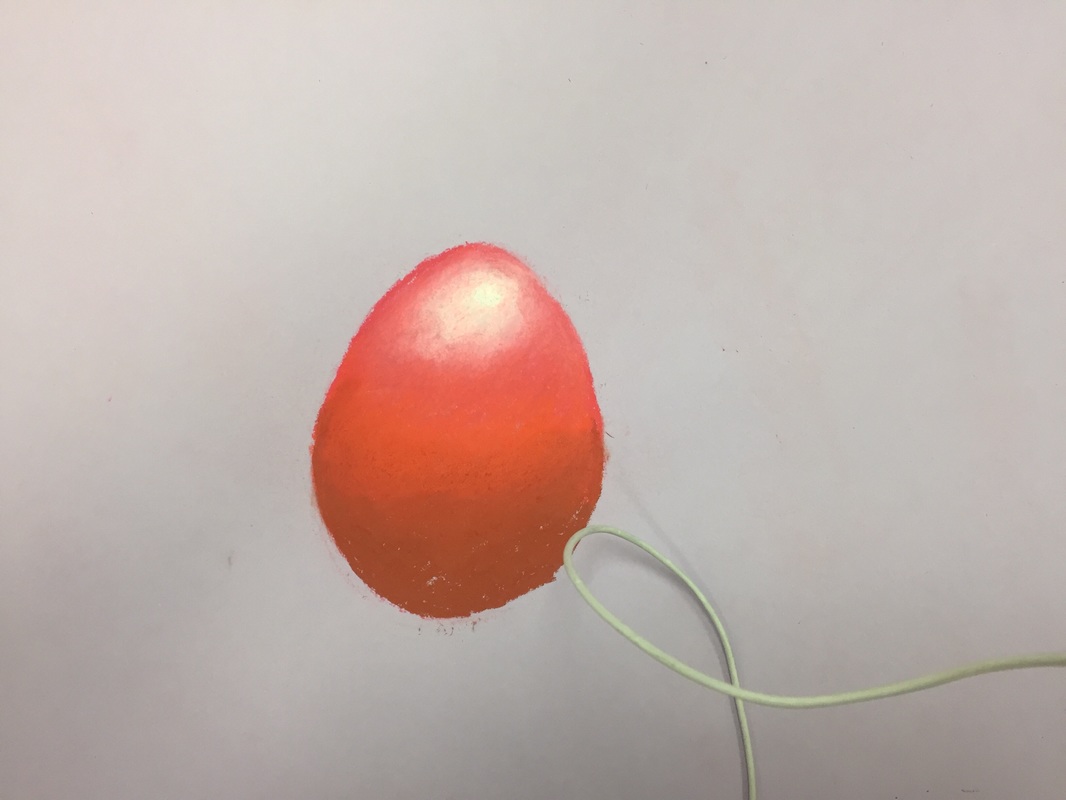
Working With Chalk Pastels- Egg Project
|
For this project we worked with chalk pastels (either the block pieces or chalk pastel pencils) to create an egg. We were told to take pictures of 2 or 3 eggs with dramatic lighting and use that to draw eggs with multiple chalk pastel colors to create value and depth. I used warm colors on one egg and cool colors on the other egg, I thought the contrast looked cool. I also did a background, the way I blended it on the paper makes it look like it has texture which is pretty cool! I wish I could've done better on the shadows, though.
|
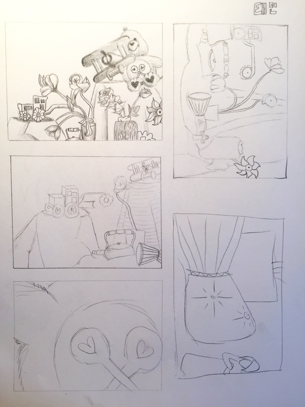
Still Life- Compositional Sketches
|
Here were 5 compositional sketches we did of the still life prior to the final project. We were supposed to pick one of the viewpoints we used and start the still life from that angle, and I chose the top left one to do. It seemed the most put together (I even shaded it a little lol) and the compositional sketch I did is actually almost identical to my final in the style and perspective of it, which is kind of cool!
|
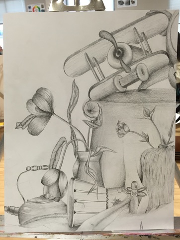
Still Life- Final Project
|
1) I think my piece is pretty clean, I really worked on the shading so that it wasn't too 'liney'. I think all the transitions came out pretty smoothly.
2) Although its not a realistic, the values were done pretty well. In some places I used some really dark values with a 6B drawing pencil and I used the lightness of the paper to leave out some highlights. 3) The lighting wasn't coming from one specific place, it was coming from around a bunch of angles so it was hard to accurately capture the light. 4) The compositional sketches helped me with perspective- I was able to look at them to help figure out placement of products. 5) I think I succeeded in this project for a number of reasons- I really think it turned out looking pretty cool. It has my distinct style to it, which is very cartoon like, but I feel like everything is pretty distinguishable and it's not super messy. 6) I think the proportions of the project came out pretty well, it doesn't look too uneven anywhere. 7) Everything is in the bottom right corner for the most part, so I really could've worked on the arrangement in the other areas. It definitely could've been better in that aspect. 8) I would say the plane is the most eye catching thing, it's close to the center of the piece and the value/shading catches your attention. 9) I could've managed my time better, I finished on the last day we had to work on it. If I had been more efficient I would've been able to add more in the left part of the piece for sure. 10) I really didn't like sketching everything out, it's such an involved piece that I felt like everything I drew would turn out wrong somehow. That probably is part of the reason I didn't do the entire left side, but what I did draw came out pretty well I think! |
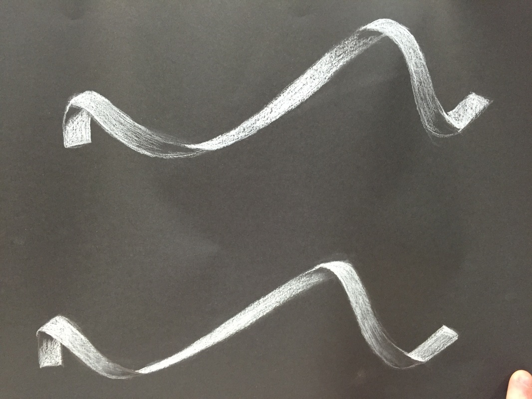
White Ribbon
|
In class we worked on drawing two ribbons using two different mediums- a white prismacolor and a white charcoal pencil. The prismacolor is the one on top, and the white charcoal is on the bottom.
I prefer the prismacolor because that's what I'm used to working with, but it was nice getting used to a white charcoal pencil instead of the clasic black. |
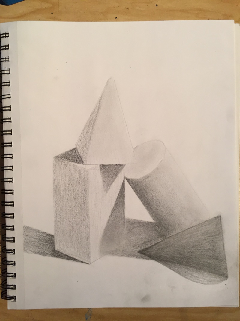
Working With Value- Shading Shapes
|
We arranged 4 various shapes in a unique way on the table and were told to shade them in with full value. I actually love all three of the shapes except for the dark black one. It was black in real life but I HATED how it ended up, I couldn't get the value right once I had ruined it, but overall I think it turned out okay.
|
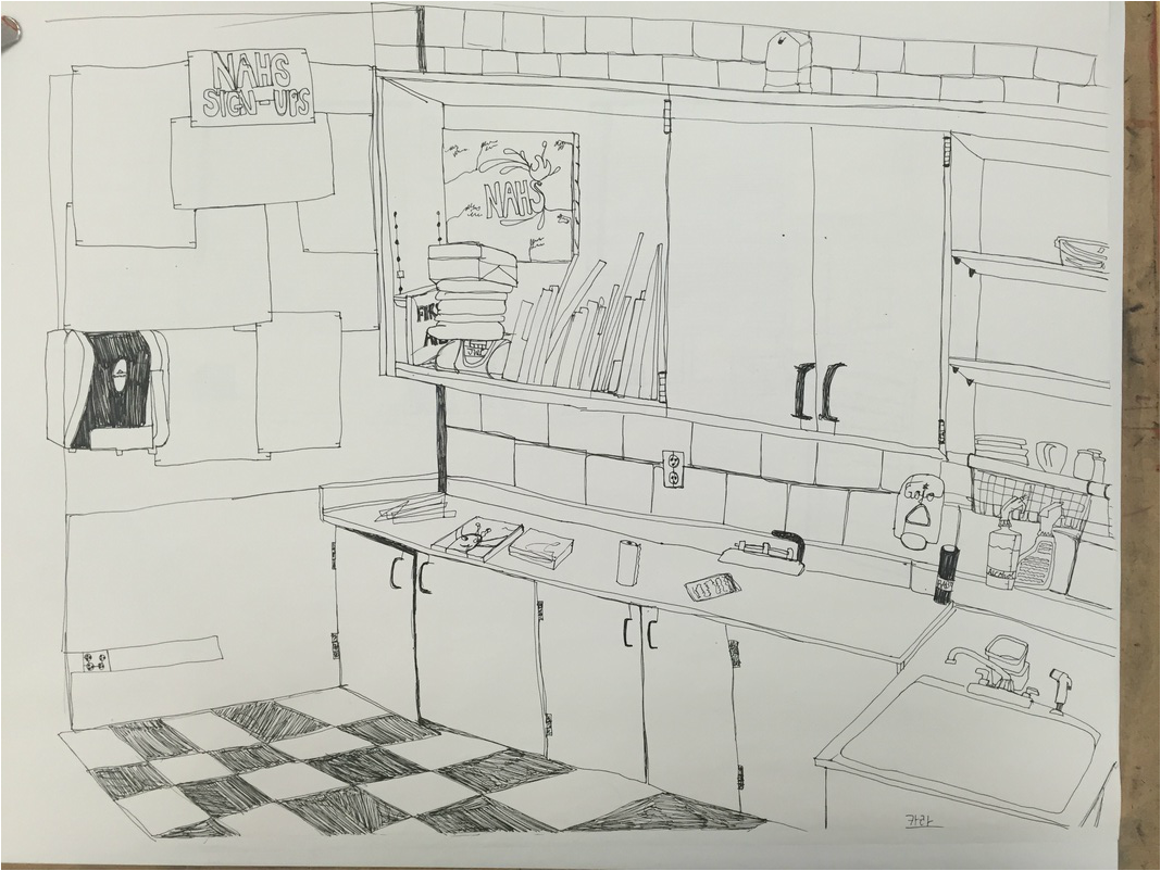
Final Contour Project- Room Drawing
|
This was the final project I came up with for the room drawing. It ended up looking a lot better than the practice one in my opinion, there was more detail which made it look way more complete to me.
|
Practice Room Contour Drawing
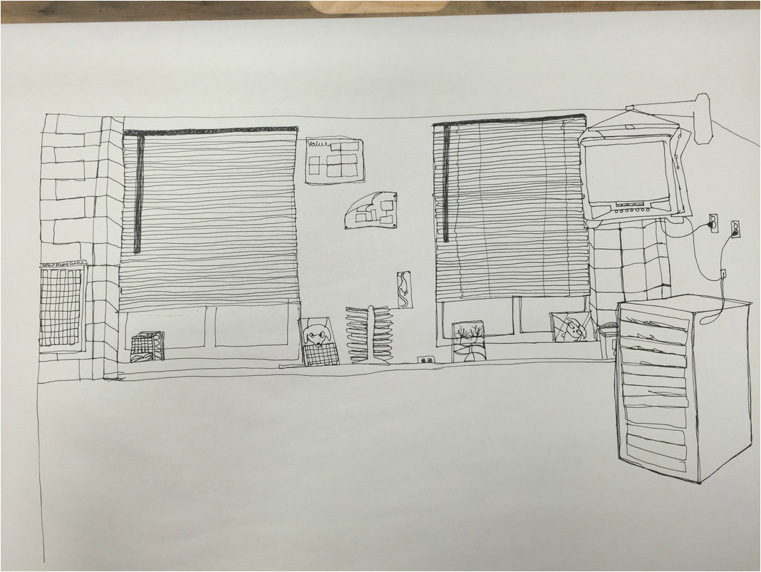
|
So this is the practice contour drawing we did of the art room. Personally I'm not a fan of contour drawing in general, but for the room drawings they actually come out kind of neat looking! This piece was in preparation for the full final contour project of the room.
|
First REAL Contour Drawing- Backpack
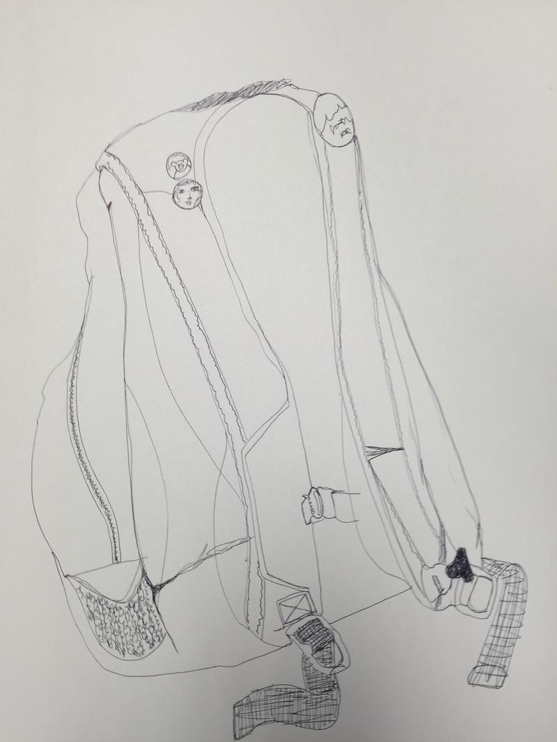
|
We're working with contour drawing (definitely not my favorite thing) and drew a backpack placed on the table. This is what I came up with-
|
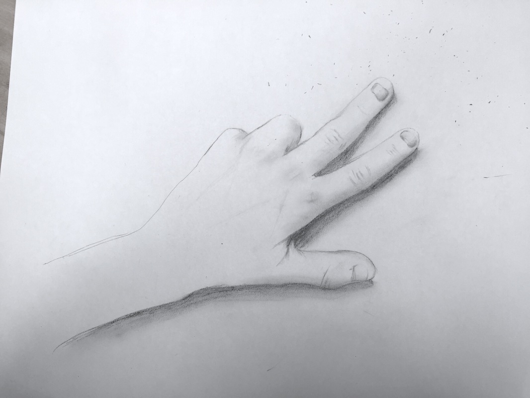
First Hand Drawing- Blog Update Cram Time!
|
Hello!
A while back we were told to draw a hand- not using contour lines or anything, just to get a feel for drawing something from real life instead of using a reference picture, this is what I came up with. |
For what it is, I'm not unhappy with it. It definitely could've used more value and detail, but I'm glad I was able to get a decent idea of the shape without using a reference picture!
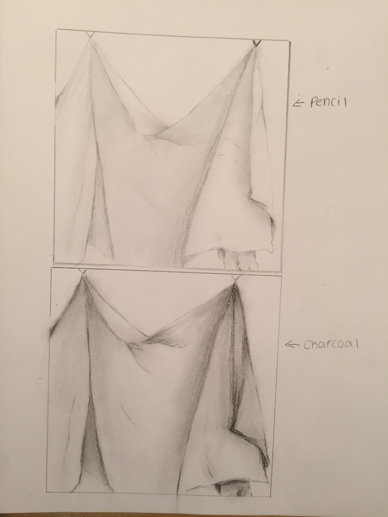
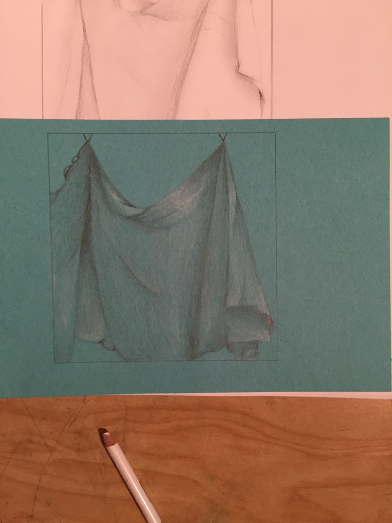
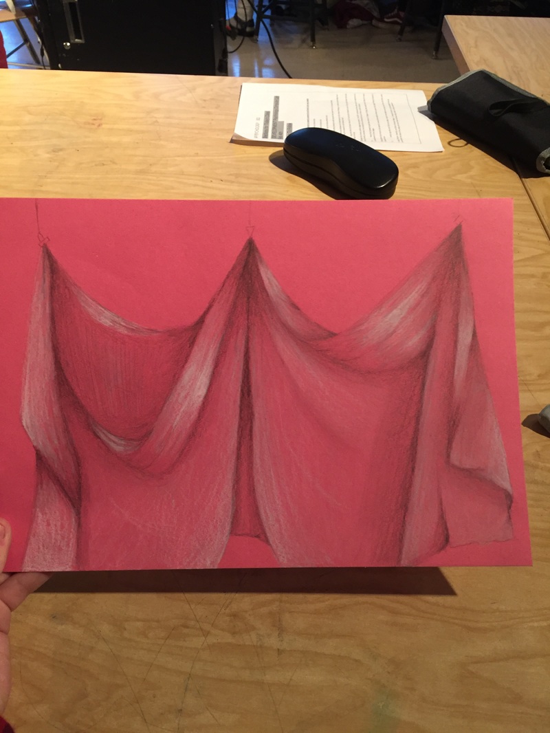
Drawing Final- Fabric
1) I think I definitely could've used more values, but I don't think my use of values was way too little. You can see the change in value in the folds, but it's still not up to the standard that I'd like it to be.
2) Doing the 9 step value chart helped with being able to get used to the pencils I was using so that I could accurately represent them in my work.
3) Because I used a pencil and a white prismacolor for my final, blending was fairly easy as prismacolors are very buttery-like pencils in my opinion. I was able to add more pressure in areas that needed shadow, and I just used the white prismacolor to add highlight to the piece.
4) Fabric has a lot of texture. It has folds and creases that you have to use value perfectly to imitate when recreating the image.
5) I would definitely add more value. I feel most insecure about the fact that I was "afraid of the dark" as Mr. Sands likes to say.